When I first started my research I read an essay, as recommended by my tutor. It goes by the shortened title of "To Stitch The Cut" and speaks about the argument of intermediality within music packaging – especially the record sleeves in both a past and modern era.
The text is pretty darn good, and I will be re-reading it again soon, as a sort of re-cap.
From the text I began to understand not only the term of intermediality but also how this is applied by consciously and sub-consciously by designers and musicians; and from this I decided it would be a great idea to have it as a feature in my essay.
https://www.academia.edu/6862043/_To_Stitch_the_Cut_The_Record_Sleeve_and_its_Intermedial_Status_Changing_Borders._Contemporary_Positions_in_Intermediality_Arvidson_Askander_Bruhn_F%C3%BChrer_eds._Intermedia_Studies_Press_Lund_2007
Wednesday, 28 October 2015
Tuesday, 27 October 2015
Sleeves in reverse
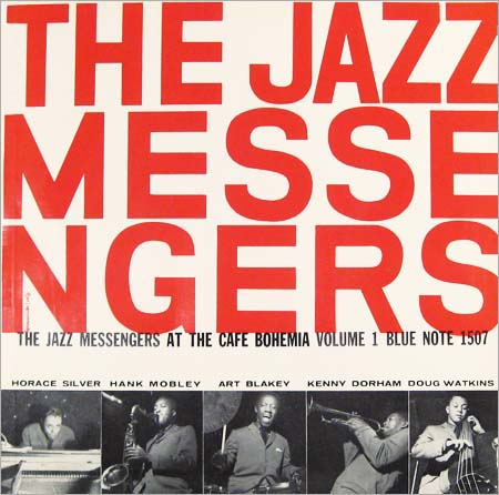
In previous blog posts I have spoken about the sleeves and the design they held; pondering whether they are still prevalent and whether they influenced the sale or the music itself, but I am yet to fully talk about the reverse of the sleeves, and this is rather important on jazz records.
Where Jazz records are concerned – especially 50's be-bop jazz records – their sleeves were designed specifically to sell them to you. They followed the modernism that was hovering over America, they used intermedial design to set the scene and most importantly, they had a large area of text on the reverse giving you an insight into the record.


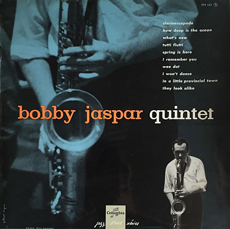
Above, is a record I own. This record is what I would synominously link to be-bop jazz, and I feel is a prime example of 1950's modernism working it's way into the music scene and the jazz scene.
As you'll be able to see, the reverse of the sleeve isn't nearly as exciting as the cover when you look at it's design but it's still not sure of modernist touches. Like almost every LP on earth it lists the tracks, serial number, printing information and some credits.
The introduction starts with "THIS CHEERFUL", which alone is a strange way to start an introduction but also gives a real insight into the music contained within the sleeve. Along with that, you've got a highly legible, smart, serif font in a strong structured grid of paragraphs, headings and sub headings. This level of structure was unlike almost all record of it's time, mostly due to the fact that the LP had only being recently been invented.
Where Jazz records are concerned – especially 50's be-bop jazz records – their sleeves were designed specifically to sell them to you. They followed the modernism that was hovering over America, they used intermedial design to set the scene and most importantly, they had a large area of text on the reverse giving you an insight into the record.
As you'll be able to see, the reverse of the sleeve isn't nearly as exciting as the cover when you look at it's design but it's still not sure of modernist touches. Like almost every LP on earth it lists the tracks, serial number, printing information and some credits.
The introduction starts with "THIS CHEERFUL", which alone is a strange way to start an introduction but also gives a real insight into the music contained within the sleeve. Along with that, you've got a highly legible, smart, serif font in a strong structured grid of paragraphs, headings and sub headings. This level of structure was unlike almost all record of it's time, mostly due to the fact that the LP had only being recently been invented.
Thursday, 22 October 2015
Exceptions to the Rule
For my essay I was wanting to look at how the Vinyl record lost it's popularity due to loss of interest and necessity. One of the hypotheses I wanted to explore is that; as the market of music developed more to digital music, people had less of a need, and less of a demand for well designed tangible packaging.
I had already explored this idea in the previous post "Music Packaging–now". In that post I explained how I felt digital music made had very little link towards physical packing or even visible packaging; streaming services and music downloads use the artwork but don't display and promoted it up-front as it had previously been done.
Aside from this, there is a small margin of artists and labels producing high quality artwork; arguably driving the sales of vinyl and contributing to the modern era vinyl revival, these records are the exception that help prove the rule. As the idea that music packaging has lost it's soul and it's prevalence can only be truly proven by it's exception.
Beach House – Depression Cherry


The Magic Whip was released last year, and with the standard LP, you were given a poster; a reflective rear of the sleeve, 2xLP's, inner art and a full stylised package (styled to look Japanese)
This was really a massive incentive to purchase the album. I didn't completely enjoy the album, but the quality of the packing has on many occasions almost-persuade me to purchase it.
Father John Misty – I love you Honeybear


With the deluxe version of Father John Misty's latest LP, you were given not only fantastic alternate illustrations but you also had an inner gatefold pop-up image, along with two random triple split LPs.
This is something very much of a special item, and once again making the idea of niche sales on the limited and special nature of specific records proving the rule.
This was a great idea, but unfortunately warped the two records making them completely useless; but still pretty. And that's the important bit!
I had already explored this idea in the previous post "Music Packaging–now". In that post I explained how I felt digital music made had very little link towards physical packing or even visible packaging; streaming services and music downloads use the artwork but don't display and promoted it up-front as it had previously been done.
Aside from this, there is a small margin of artists and labels producing high quality artwork; arguably driving the sales of vinyl and contributing to the modern era vinyl revival, these records are the exception that help prove the rule. As the idea that music packaging has lost it's soul and it's prevalence can only be truly proven by it's exception.
Beach House – Depression Cherry

A very modern and recent release, making what would likely be a very popular album for streaming, also interesting to purchase with the introduction of a red crushed velvet sleeve.
Blur – The Magic Whip

:format(jpeg):mode_rgb():quality(96)/discogs-images/R-6932044-1431719976-1607.jpeg.jpg)
This was really a massive incentive to purchase the album. I didn't completely enjoy the album, but the quality of the packing has on many occasions almost-persuade me to purchase it.
Father John Misty – I love you Honeybear


This is something very much of a special item, and once again making the idea of niche sales on the limited and special nature of specific records proving the rule.
This was a great idea, but unfortunately warped the two records making them completely useless; but still pretty. And that's the important bit!
Tuesday, 20 October 2015
The learnings from The Colouring of Jazz
Today I read: The Coloring of Jazz: Race and Record Cover Design in American Jazz, 1950 to 1970
by Carissa Kowalski Dougherty and it rather a very helpful read.
I got it as an e-book through Quest and it may be in print but I haven't found it if it is.
From reading this I have found out a bunch of good things, and things that I wanted to research further; and that's what this blog post will be about. One thing that the essay spoke about, which seemed very important to me was about specific designers in the 50's that I hadn't already looked at.
They are not as important as other things. but they certainly help set the context of the era very well.
Firstly we have, possibly one of the first record designers and he is quite notable in the field Alex Steinweiss.


The essay informed me of much more, and I will explore them in later posts; but for now I thought it was important to show the research I had made into designers working in the field of record sleeves and more importantly designers that were working on jazz records.
by Carissa Kowalski Dougherty and it rather a very helpful read.
I got it as an e-book through Quest and it may be in print but I haven't found it if it is.
From reading this I have found out a bunch of good things, and things that I wanted to research further; and that's what this blog post will be about. One thing that the essay spoke about, which seemed very important to me was about specific designers in the 50's that I hadn't already looked at.
They are not as important as other things. but they certainly help set the context of the era very well.
Firstly we have, possibly one of the first record designers and he is quite notable in the field Alex Steinweiss.


Alex Steinweiss basically invented the album cover whilst working as the art director at Columbia Records; and almost any record design could be linked back to him. Not only did he create the first fully designed record sleeves, he did them with great style and a strong focus on typography.
Secondly, we have David Stone Martin
David Stone Martin was also a very famous designer working in the field of record sleeve design; and just like Reid Miles and Alex Steinweiss; he worked in on mostly jazz records, helping shape the industry and design alike.
The essay informed me of much more, and I will explore them in later posts; but for now I thought it was important to show the research I had made into designers working in the field of record sleeves and more importantly designers that were working on jazz records.
Monday, 19 October 2015
Music Packing—now
With the introduction of the mp3 and digital music downloads, it's quite possible to say that the sleeve or even the music's packaging became very much irrelevant to the modern mass market.
Packaging, the premium product and the charts started to accept the digital download.
The rise of mp3's and the current popularity of streaming makes the record sleeve feel less and less relevant in the modern era. It still exists because millions of old records are sat in them, and vinyl pressing plants still exist; but vinyl sales for a modern artists are a niche market.

I knew who David Bowie / Ziggy Stardust was, and I had heard his music before, but I had never actually sat down to listen to this album before buying it that day.
If you look at how Spotify (the largest music streaming service) displays the album, you can see where my argument comes in. On the left is a 400 x 400 square image of the album's front cover, though it's only there because I chose it to be there; otherwise it's minimised by default.
Then in the centre, above the tracks is an even smaller shot of the album, which is half coved by the 'playing' symbol. It's like this because for people using streaming services the draw of the record sleeve doesn't matter. There is no need for them to look at the high quality photograph, because they aren't purchasing the record, and there is no need to read any of the information because it's not a tangible item—all that is needed is the ability to hear it and to know the name of each track.
If you look at it this way, it very much feels that for the mass market has no time for the record sleeve and it's relevance is all but faded. But on the other hand, with the recent rise of popularity for vinyl, perhaps there is an exception that proves the rule.
Packaging, the premium product and the charts started to accept the digital download.
The rise of mp3's and the current popularity of streaming makes the record sleeve feel less and less relevant in the modern era. It still exists because millions of old records are sat in them, and vinyl pressing plants still exist; but vinyl sales for a modern artists are a niche market.

Above is a screenshot of me streaming my favourite David Bowie album; of which I own on vinyl.
I'm using this album as a case study because I bought this record as one of my first records, and I bought it almost completely blind, based on the design.I knew who David Bowie / Ziggy Stardust was, and I had heard his music before, but I had never actually sat down to listen to this album before buying it that day.
If you look at how Spotify (the largest music streaming service) displays the album, you can see where my argument comes in. On the left is a 400 x 400 square image of the album's front cover, though it's only there because I chose it to be there; otherwise it's minimised by default.
Then in the centre, above the tracks is an even smaller shot of the album, which is half coved by the 'playing' symbol. It's like this because for people using streaming services the draw of the record sleeve doesn't matter. There is no need for them to look at the high quality photograph, because they aren't purchasing the record, and there is no need to read any of the information because it's not a tangible item—all that is needed is the ability to hear it and to know the name of each track.
Effectively the packing is little more than the name and a small image; when compared to the 12", thick card sleeve that contains a thick circle of vinyl, and a paper sleeve is the previous owner took care of it.
If you look at it this way, it very much feels that for the mass market has no time for the record sleeve and it's relevance is all but faded. But on the other hand, with the recent rise of popularity for vinyl, perhaps there is an exception that proves the rule.
Saturday, 17 October 2015
Recent readings
I've been doing some more reading recently, so I thought I'd share what I've been reading to help display the idea of where I'm heading.
Firstly, I borrowed the book titled "Modernism" from the library to get a general idea of Modernism; though I already read about American Modernism, I felt that knowing the overall trend of Modernism globally could help put the work I was looking at into context.
Firstly, I borrowed the book titled "Modernism" from the library to get a general idea of Modernism; though I already read about American Modernism, I felt that knowing the overall trend of Modernism globally could help put the work I was looking at into context.
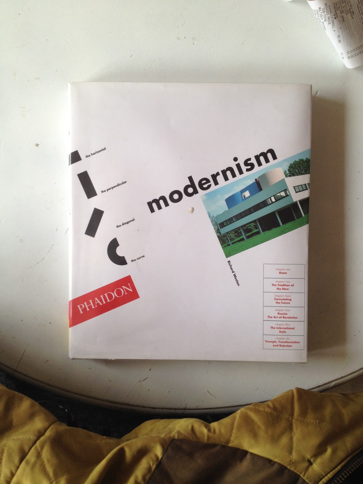
Richard Weston – Modernism
ISBN (0-7148-4099-8) Phaidon Publishing
Secondly, I have the most plain covered book in history. I believe it's almost a perfect square, it hasn't any information on the cover other than the trade mark "Blue Note" blue. This book has a brief history on the designers and the company but mostly displays the covers of one of America's biggest labels, and quite certainly the biggest jazz label in the 1950's.

Graham Marsh – Blue Note: The Album Cover Art
ISBN (0-8118-0036-9) Chronicle Books
I've also been using Quest to get a range of readings, of which I'm slowly working my way through but below are the name of the extracts and books I'm reading through.
Artificial White Man: Essays on Authenticity, 2005
Chapter: The Late, Late Blues: Jazz Modernism
Artificial White Man: Essays on Authenticity, 2005
Chapter: The Late, Late Blues: Jazz Modernism
ISBN: 9780465015160
Creative Review; Oct2013, Vol. 33 Issue 10
Article: The record sleeve as an art form is dead
Modernist America: art, music, movies, and the globalization of American culture / Richard Pells
Yale University Press, 2011.
Friday, 16 October 2015
Music Packaging—then
For part of my essay I'm wanting to look at the comparisons of modern music packing and how it was in the past; though focused on record sleeves and the early jazz records.
In 1950's America, the uprise of Be-Bop Jazz was in it's growing state; it was selling very fast among the creatives and it was all supported by the modernist sleeves. People hadn't seen much like this before, never mind for the cover of a jazz record. Previously records were on at 78rpm and came in plain packaging, so the mixture of high quality photography, free-from jazz and modernist design made these records the 'must have' items for many people.
This wasn't just a trend that was prevalent in Modernist America, this trend went on to influence designers around the world. It's argued that the rise of the American Modernism design sign grew from the studying of the early European Bauhaus works; but even so the trend caught on and quickly Europe caught back onto the ground that it helped establish.


In 1950's America, the uprise of Be-Bop Jazz was in it's growing state; it was selling very fast among the creatives and it was all supported by the modernist sleeves. People hadn't seen much like this before, never mind for the cover of a jazz record. Previously records were on at 78rpm and came in plain packaging, so the mixture of high quality photography, free-from jazz and modernist design made these records the 'must have' items for many people.
 |
| An original 78rpm Jazz Record in it's sleeve |
This wasn't just a trend that was prevalent in Modernist America, this trend went on to influence designers around the world. It's argued that the rise of the American Modernism design sign grew from the studying of the early European Bauhaus works; but even so the trend caught on and quickly Europe caught back onto the ground that it helped establish.
This all helped the 33rpm jazz records hold infamy in popularity and design modernity; but as a contrast I'd like to look at what happened when the mp3 hit the modern music markets—to contrast whether the record sleeve is still relevant or whether (like in the past) the rise of a new popular format and packaging pushed the previously popular into the hands of enthusiasts and out of the mass market.
Monday, 12 October 2015
The effect of American modernism on record sleeves
As I had said before, I wanted to argue over record sleeves and one topic that I'd like to debate is whether record sleeves were more popular and prevalent when they were more desirable. I want to argue that record sleeves are important and the intermedial link exists, but did the importance disappear as time progressed, this the format loosing it's pace and modernism becoming the modern.
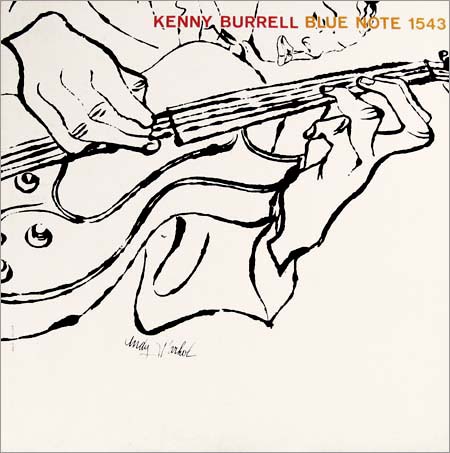
Though he is not to my preference; one of the most notable modernists that worked directly to influence record sleeves was Andy Warhol. Honestly, there is little more modernist in 1956 than a Be-Bop Experimental Jazz record pressed on Blue Note, encased by a Warhol illustration.
I don't know how else I could argue this album other than I'd almost a literal definition of American Modernism in that time; with the expressive illustration with a direct intermedial link to the record.To me, the image looks like it all flows from a single link, with varying widths and a sense of freedom and 'non-perfect'ness. That's really not a word at all, but I can't think of any other way to describe it. I could be totally wrong, but why not have a listen, I think you'll find I'm not.
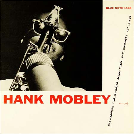
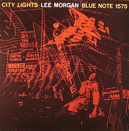
I wrote before about a few modernist designers, and posted work by the three favourite designers I found and hadn't heard of before; and now their influence can be seen here.
I wrote about Otto Storch's typography and the illustrations that Willam Golden commissioned and used in his editorial designs; their work, their influence and their modernist appraoches can be seen very strongly in these other two Blue Note record sleeves.
It could be argued that the Hank Mobley feel reminiscent of Bauhaus typography, and you wouldn't be wrong as I feel American Modernism echoed and lead right off where they left, and although the Lee Morgan record is photography based; the light, crossing and varying lines give a real feel of illustration like that used by William Golden and the work of Andy Warhol.
Sunday, 11 October 2015
Key Studies
Thinking about what I previously wrote, I feel that thinking about my key studies would be a good idea.
Clearly I will be wanting to use the 1950's and the ride of Be-bop Jazz are a key study but I feel it might be worth mentioning that I think looking at the prevalence of the sleeve as both an item of desire, branding and protection. I want to make the argument that it is a necessity and with that, it is intermedial whether you want it to be or not.
I feel making a comparison from the 1950's to a more modern time would also make a lot of sense; debating the topic of mp3's, digital downloads, the fall of physical music media but also the recent rise of Vinyl records. I feel it would be a good idea to show where the sleeve is disappearing in the modern music industry but also noting where it still has a place and need; like in small record label and the popularity spring in the vinyl market.
Along with these two key studies I can make an argument about the suitability and the sustainability—asking whether we really need the physical sleeve, to stop un-needed pollution; whether the rise of popularity in vinyl has made the sleeve less significant, as popular music floods the market, and question whether the sleeve actually still works as a selling point and whether it is truly bound to the music or if either can exist without the other.
Thursday, 8 October 2015
A greater grasp
After a few days, a talk with my tutor and a long hard think; I've realised that things haven't quite been correct with my process and ethos for my dissertation. I didn't have an argument, I was focusing on a subject that should really be a case study and it was becoming too historical.
I am wanted to look at the Be-Bop jazz in the 1950's, the modernism surrounding it and the idea of intermedial design—after a period of thought I've realised that the idea of intermedality could work very well in the overall essay though American Modernism and Be-Bop jazz would make for an excellent key study.
I only recently realised that an argument is an essential for the essay and without realising I had stumbled right into making a more historical essay than desired. In the hope of not making things too historical and influencing an argument; I feel I should make a comparison with modern day just as I look at a period in the past.
As I spoke to the tutor he made me aware that we both felt that (as record collectors) we didn't really think of music coming without it's design. That the design is linked or stitched to the music, thus reinforcing the idea of intermedality. As an idea for an argument I was wondering whether I could debate whether the design can be separate to the music, or whether you can ever truly get one without the other.
So, as a huge change before I was thinking to ask the question Is music held within the intermedality of it's design, or has the intermedial link between the two perished as the sleeve became less prevelant?
I also have a few other ideas that go along the lines of:
- Looking at American Modernism in the 1950's, was the intermedial link more important than it is today, in the modern record industry?
- Is music linked to it's design by intermedality, and could the two exist without one another? How does this stand in the modern music industry compared to the rise of Be-Bop Jazz in the 1950's
Wednesday, 7 October 2015
A few modernist painters to know
To put the 1950's into context, I want to take a closer look at the designers, artists and other creatives operating at the time; thus putting the designs of these records in perspective for modern day and historical context.
This post will just be looking at some of the designers that were operating at the time, analysing their work to see where it fits into the grand scheme of the 50's.
The painter of shapes and colours, the modernist that is Mark Rothko


Mark Rothko is not really a favourite of mine, nor is he quite an emeny. He's like the friend that you put up with because he's kind of nice; and the one you hang out with when you are sick of hearing Lichtenstien go on about his pop art crap.
Whether I like him or not isn't really point here though; without doubt he is very much an influential and significant modernist painter—if anyone would go on to inspire and display the times of modernist 1950's he'd be at the forefront.
The grubby mess; Jackson Pollock


Though the man's artworks have the technical capabilities of a drunken pig with broken front legs, his work was more influential than almost any painter in the 20th century. He was highly influential in the 50's, where he produced almost all his more famous pieces.
My woes aside, you can see exactly where he fits into the rise of American Modernism and the influence of freedom, intermedality and expressionism that design was producing thereafter; as a direct response to the path he cut with his eccentric paintings.
My woes aside, you can see exactly where he fits into the rise of American Modernism and the influence of freedom, intermedality and expressionism that design was producing thereafter; as a direct response to the path he cut with his eccentric paintings.
Tuesday, 6 October 2015
A few modernist designers to note
To put the 1950's into context, I want to take a closer look at the designers, artists and other creatives operating at the time; thus putting the designs of these records in perspective for modern day and historical context.
This post will just be looking at some of the designers that were operating at the time, analysing their work to see where it fits into the grand scheme of the 50's.


This post will just be looking at some of the designers that were operating at the time, analysing their work to see where it fits into the grand scheme of the 50's.
Firstly, we have Gene Rederico:


From the research I have done, I've found that Gene Rederico is quite possibly one of the best designers I've ever come across, and I'm mildly saddened by the fact I hadn't known of him earlier.
His playful natured, modernist approach to his design makes him (in my eyes) and fantastic designer. I feel that the modernity and creativity of his work creates a real epitome to the state of design, economy and freedom in post-war america.
He would make an excellent subject for a case study into the design of 1950's america, especially if I were to focus on the modernism of it all.
Secondly, the slightly less documented, though highly prominent Willam Golden:

Though this man made quite an effect on the design industry, leading the way with branding systems and simple logos for television stations. His design outfit and branding guidlines for CBS created a whole revolution of structured, employee level brand guiding.
He was highly influential, and would likely intertwine with the designers I have researched for their standing on modernism and the designers that were working on the early be-bop record sleeves.
He was highly influential, and would likely intertwine with the designers I have researched for their standing on modernism and the designers that were working on the early be-bop record sleeves.
Otto Storch, and his fantastic typography


Along the other designers I have noted here, Otto Storch was never a huge name in design when compared to the likes of Paul Rand & Herbert Bayer – but his design, or more importantly his look at typography really showed not only the world of design he was opperating in. It also shows the rise of consumerism and the post-war economy in America.
Subscribe to:
Comments (Atom)