Monday, 28 September 2015

Analysing the image

As another recommendation from my tutor, I will be analysing the the image of the sleeve.

This goes further than just looking at the imagery on the record sleeve, it is an analysis of colours, typography and the abstract nature of the design. This all together with the intermediality of the sleeve and seeing how this does or does not relate to the music held within the sleeves.

But most importantly of all, I need to look at the semiotics of these sleeves. Yes, it has been said, as it was inevitability to be said at some point. SEMIOTICS! FLIPPIN' SEMIOTICS! WE ARE TALKING ABOUT SEMIOTICS, IT'S ONE STEP AWAY FROM DISCOURSE.
THIS IS FRIGHTING, COMPLICATED, WELL CHARTED LAND I HAVE STEPPED UPON!

So, without the theatricals, I am indeed wanting to research the semiotics of record sleeves and how their modernity (or intermediality) has been enforced by the colours, images and text that they present.

Let's (if we can) talk about possibly the hero of Be-bop and the very much modernist designs that are held on the sleeves of Miles Davis; especially the ones that were published by Blue Note Records.
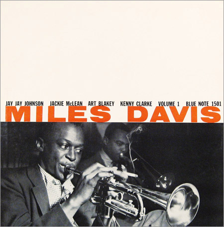

Firstly, we'll look at the aesthetics. We've got an image of Miles, which was very common on any record, but pushing that image to the bottom is a huge white space—this was very different.
Record sleeves designs would usually have all space used to display information or more likely have a larger photo.

The huge amount of white space is the very first thing you see, and it portrays a more of a modern feeling than a blank one that you'd imagine; the face that the type and image has been squeeze down to less than half the sleeve makes you instantly look at it and think 'Why?'.

Why; why not? That is the exact approach of the modernist designers of the time. Just because it hadn't been done before, doesn't mean it is wrong.

The imagery shows mostly Miles Davis but there are a few things of note you can see, that really give character to the sleeve. Firstly, you'll likely notice he is playing his heart out on the Trumpet – but he's also got himself a cigarette, half smoked, and balancing on his fingers. This cigarette displays more of this 'cool jazz' ideology, and reinforces a sense of rebellion and the disregard for complete professionalism.

Above that, you can see the typography. Which has a strong hierarchy, though a strange one.
Miles Davis is the main sale of this record, though he isn't the only performer, as is any Jazz Record.
Because Miles is the main sale, his name is the largest and in a contrasting colour. Above that we have the supporting artists, in a slightly smaller point size and more mundane colour.

The modernist, and different approach that this sleeve has is exactly what the 'cool jazz' cliché has sprung from, and using these methods of analysis and the exploration of discourses, I could easily include particular sleeves and design movements in my essay.

Monday, 14 September 2015

Looking at the modernism of the 1950's in context

I have recently been reading the book American Modernism Graphic Design 1920s to 1960s; in which to get an idea of context of the decade of the 1950's. I have been reading through and it has been throwing countless names and advertisements at me—some of which I knew and some that came as a surprise to me.

The book covers artists that were prevalent in the era, as well as economic movements and political stances. It does little to explain these different contextual things, but I have a small knowledge of them already so it's a lot easier to expand on them. It brings to light the Detroit motorcar industry boom, the post-war economy and the movement in politics with civil rights acts.

As it stands, American in the 1950's was crawling with modernism and it's quite often known as the point of great modernism before post-modernism began. In the same decade you have Rosa Park's bus strike, as you have the beat poets and be-bop jazz, all the while inspiring the freedom in Jackson Pollock's abstract art; reflected by the installations and sculptures of Allan Kaprow and Claes Oldenburg.


In the book, they refer to the the 50's as the 'calm before the storm' because everything was moving but it hadn't quite exploded yet. Politics became a battle between liberalism and xenophobic democrats; making everything quite uneasy, especially with the surge in economy from the breakdown of the war. It was also a turning point for Graphic Design—where we no longer just setting type in layouts, they were using typography to support and image like an illustration rather than just a reading context. Graphic Design's became hired to work in-house with huge companies and their points became valid in huge board meetings and advertisement sectors.

The 50's was the era of the 'corporate identity' with the likes of Paul Rand designing not only just a logo for IBM but a whole instruction manual on how they should, run, structure and implement their brand; there was also the CBS logo, which set the whole branding system alight across america, with it's innovation and (of course) modernism.


Along with the designers, artists I've already mentioned I have found a few more that I really did like and found to be contextually relevant.
  • Gene Federico
  • Herbert Bayer
  • Cipe Pineles
  • Lester Beall
  • William Golden
  • Otto Storch

Saturday, 29 August 2015

I borrowed some books—like a good dissertation writing student

I went to my library to forage out paper structures known as books. Though their format scares me due to not being digital, I will trust that these items of witchcraft could help me with my essay.

After a bit of digging around I had found a few books that I would both like to read for my dissertation, and we sitting on the shelves of the universities library. So I got myself two books to start with until I find some more suitable ones.

Being fashioned as a hat by our model is the lovely and extremely sexy:
Robert Brownjohn – Sex and Typography (ISBN 1-56898 550-9)
Princeton Architectural Press

Though not strictly relevant, this book is of a designer (a rather influential one at that) operating with great modernity in America through periods of time including the 1950's. 


Next up in that traditional 'I'm holding something design-ish to cover my horrid face' pose is an actual book about American Modernism; looking as american as an book possibly could.
R. Roger Remington – American Modernism, Graphic Deisgn 1920 to 1960
(ISBN 1-85669-345-7) Laurence King Publishing Ltd


There isn't much more I can tell you about this book that the title doesn't already. But my god, my are my arms so freakishly large?

Sunday, 23 August 2015

Looking further into the historical context

On recommendation of my tutor, I have decided to look at the historical context of the modernity in 1950's America, not just the case of be-bop jazz records.

The modernity in american graphic design did not start and end with Bebop Jazz, nor did it with Blue Note records. The records and their sleeves were merely a reflection of what was happening around them, so it would be wrong not to see the design that surrounded these records, in the books and on the shelves.

As one of my possible resources I have found a book that I have seen a few times, and it's really pretty much the most obvious choice for me. The book is titled – quite rightly – American Modernism by R. Roger Remmington (http://yalepress.yale.edu/book.asp?isbn=9780300098167)
I'm pretty sure I've seen it kicking around in the local bookshop, so it'll be a sure purchase for the next time my loan comes in.

Whilst having a little browse around I also came across a specific webpage listing modernist, and quite usefully it lists a lot of designers that operated in the 1950, and unsurprisingly it has many designer that I'm already aware of and quite admire. http://www.citrinitas.com/history_of_viscom/modernists.html
Though it's not strictly all american's that are listed, it's still a good insight into the design and modernism of that era.

A very influential designer that worked through the 1950's, and a favourite of my own would be Massimo Vignelli. Looking at him and his works would be a good way of judging how the modernity carried through the years as he continued working until the late 20th century.
http://www.aiga.org/medalist-massimoandlellavignelli/

One book I just found on my university library catalogue is Robert Brownjohn: Sex and Typography: 1925- 1970 Life and Work which sounds truly amazing indeed, considering how iconic of a designer he is.

I have also found a few links that could be possibly helpful, but they are really quite wildcards indeed.

http://www.anglistik.phil.uni-erlangen.de/dozenten/skripte/American_Modernism_1900-1950.pdf

http://www.nga.gov/content/ngaweb/features/slideshows/selections-from-the-modern-and-contemporary-collections.html

http://www.visual-arts-cork.com/modern-art-movements.htm

Saturday, 8 August 2015

A fork in the road

Watch out, there is a fork in the road – it'll burst your tyres.


After a bit of reading and thinking; I realised that my current question (or statement) is lacking on argument—of which I like arguing, so that's important!
So I have noticed that I may need to alter my approach to support my need to argue and the possibility for a greater essay.

As it stands, I am working with "Be-Bop Jazz Records of the 1950’s lead the way in modernity for typography and design structure through it’s expressionism and freedom—is the inspiration it supplied now prevalent in contemporary design and music? Or did it just create the cliché for the designs of cool jazz?" though I would rather like to include a few more ideas, theories and concepts.
 I would very much like to include the idea of intermedial design in the record sleeves, and rather than relate how Jazz records influenced modern design, instead focus on how the link between the design and the music was a modern concept that has since become very popular.

I would also like to include the concept of whether music can be completely autonomous, the theory of parergons and explore whether a record sleeve is just a frame and carrier for music or whether it is both between advertising and an aesthetic experience.


With this in mind I consider changing my principle question.
Be-Bop Jazz Records of the 1950's lead the way in modernity for design and typography with their high levels of expression and musical freedom, all reinforced with strong intermedial design. Is the innovation that these records held evident in contemporary design or did it just create a 'cool jazz' cliché?

This could very likely change, though I would very much like to steer towards the theorists and ideas that I've read about; and including the concept of intermediality is a step towards that.

Tuesday, 28 July 2015

Not just the cover…

After reading more into the 'intermedial essay', I was made aware of the idea of not just focusing on the design printed on the face of the record sleeve.

The idea is that the design isn't just contained on the front panel, and if an intermedial design is done correctly with a serious attention to detail; it would likely extend past just the typography and photography. It could include the sleeve, the inner, the packing and the placement in a shop.

This approach would likely be rather off subject for the essay in the way I'm currently taking it, but it is worth considering it to help with reference for ideas and theories.

I was also introduced to the term 'parerga' or a 'parergon' which refers to a metophorical artistic frame, in which an instance in contained. The essay refereed to a record sleeve as a parergon for the music, in which the art of music inside could belong in or whether the design alone is a parergon and the music is it's own, even if the design has an intermedial link to it.

I have also been introduced to the term 'ekphrasis'  though so far, even with the help of a modern dictionary; I haven't a clue what it actually means and whether I could actually use it in support of my essay.

The essay references (so far) three main theorists; of whom I will likely look further into when looking more into theorists for my essay—these theorists are:

  • Nicholas Cook
  • Alan Licht
  • Jacques Derrida 

Monday, 27 July 2015

The hunt has begun.

So as I dive into this dissertation, it would make little sense not to collate some secondary research from the lovely communities of the internet.

Quite luckily, I rather landed on my feet with this – finding directories of 1950's jazz records, small foundries of production information and quite a few documentaries along the way.

http://www.birkajazz.com/archive/bluenote1500.htm

Birka Jazz is proving a very good resource for me and this page in particular is absolutely stacked full of useful information and images. Though it's only about Blue Note Records, it still a very strong insight into the modernity of the 50's Jazz records.

I was thinking about making the essay focus on the modernity of American Jazz records and comparing it with modernity in design at that time through other mediums in america; though it could make an interesting comparison to compare the modernity in jazz records coming from american and
compare with the likes of England, Germany or even (bizarrely) Yugoslavia

http://www.birkajazz.com/archive/germany.htm

http://www.birkajazz.com/archive/otherCountries.htm

http://www.birkajazz.com/archive/england.htm

On top of these secondary sources, I was given an essay on 'intermedial' theories on record sleeves; which is proving a very interesting read, but it is also influencing the way I wish to mold the final title and synthesis of the dissertation.

Also, as a little treat; whilst looking for modernity in 1950's american design I may have stumbled across the worlds worst (and shortest) power point.
https://prezi.com/8b6mo-etw6ro/graphic-design-1950s-1960s/