This goes further than just looking at the imagery on the record sleeve, it is an analysis of colours, typography and the abstract nature of the design. This all together with the intermediality of the sleeve and seeing how this does or does not relate to the music held within the sleeves.
But most importantly of all, I need to look at the semiotics of these sleeves. Yes, it has been said, as it was inevitability to be said at some point. SEMIOTICS! FLIPPIN' SEMIOTICS! WE ARE TALKING ABOUT SEMIOTICS, IT'S ONE STEP AWAY FROM DISCOURSE.
THIS IS FRIGHTING, COMPLICATED, WELL CHARTED LAND I HAVE STEPPED UPON!
So, without the theatricals, I am indeed wanting to research the semiotics of record sleeves and how their modernity (or intermediality) has been enforced by the colours, images and text that they present.
Let's (if we can) talk about possibly the hero of Be-bop and the very much modernist designs that are held on the sleeves of Miles Davis; especially the ones that were published by Blue Note Records.
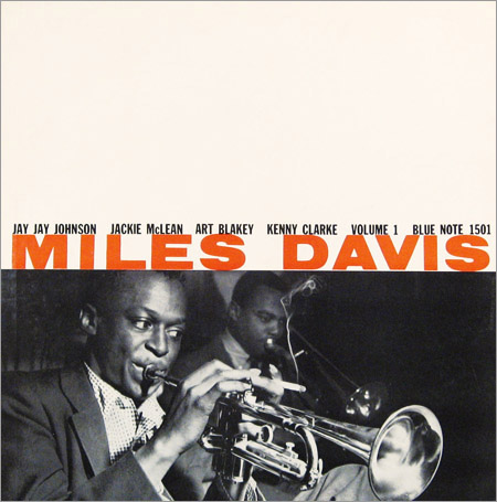
Firstly, we'll look at the aesthetics. We've got an image of Miles, which was very common on any record, but pushing that image to the bottom is a huge white space—this was very different.
Record sleeves designs would usually have all space used to display information or more likely have a larger photo.
The huge amount of white space is the very first thing you see, and it portrays a more of a modern feeling than a blank one that you'd imagine; the face that the type and image has been squeeze down to less than half the sleeve makes you instantly look at it and think 'Why?'.
Why; why not? That is the exact approach of the modernist designers of the time. Just because it hadn't been done before, doesn't mean it is wrong.
The imagery shows mostly Miles Davis but there are a few things of note you can see, that really give character to the sleeve. Firstly, you'll likely notice he is playing his heart out on the Trumpet – but he's also got himself a cigarette, half smoked, and balancing on his fingers. This cigarette displays more of this 'cool jazz' ideology, and reinforces a sense of rebellion and the disregard for complete professionalism.
Above that, you can see the typography. Which has a strong hierarchy, though a strange one.
Miles Davis is the main sale of this record, though he isn't the only performer, as is any Jazz Record.
Because Miles is the main sale, his name is the largest and in a contrasting colour. Above that we have the supporting artists, in a slightly smaller point size and more mundane colour.
The modernist, and different approach that this sleeve has is exactly what the 'cool jazz' cliché has sprung from, and using these methods of analysis and the exploration of discourses, I could easily include particular sleeves and design movements in my essay.

