In the essay To Stitch The Cut the author speaks a lot of two theorist and writers. He speaks about a lot of references, but these two are the most prominent people he refences. I haven't looked to closely into these two, but will make sure to do so when it comes to the actual writing on the essay.
Nicholas Cook
As a musicology lecturer of The University of Cambridge, he is a reputable and respectful source for referencing and using as a theorist. He is also not sure of any source materials, with around 15 published books.
http://www.mus.cam.ac.uk/directory/nicholas-cook
Alan Licht
As a preforming jazz artist, writer and theorist; I would struggle to find someone who with greater primary experience. With the word he writes being less theorised than Cook, he can be referenced less on his academia but more on his knowledge.
http://www.alanlicht.com/
Sunday, 15 November 2015
Andy Warhol; where the modernist becomes the designer
Andy Warhol, is a huge name in art; chances are, if you've heard of art, you've heard of him. But when he was a little less known, he was a designer. A designer peddling the forefront of the 1950's modernist era, illustrating and designing record covers alike.

His influences were clearly deriving from the modernist era he was operating in; with some covers showing an obvious intermedial link; such as the one above. With his illustration, he displayed the signature playing style that the artist had; I don't think there is possibly a greater example of intermedial contextualisation on a modernist record sleeve.
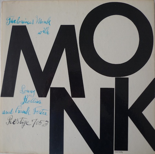
If ever there was ever a strong example of modernism on record sleeves, a sleeve designed exclusively with rough handwriting, in a time of large, bold, colourful imagery.
Friday, 6 November 2015
The prevalence of record sleeve design, when looking at it's presentation in the modern market
Once again, whilst reading The Colouring of Jazz by Carissa Kowalski Dougherty; a very valid point was raised and it's something something that I'd like to explore.
In the essay they explore the concept that record sleeves became highly popular in the 1950's, especially Jazz records because where there had been little variation and display in the past; there was now racks full of colourful, easily browsed records to touch and look at.
And saying that this change influenced sales seems like a very plausible hypothesis to me, and I highly doubt that it's wrong because it's exactly the reason I got into record collecting.
What I'd like to do is look at home, in this modern era I would browse digital music from a popular source and how I would browse tangible record sleeves, also from a popular source (high street store) to see whether – even though records make up a very small amount of stock for modern music shops – that they are still prevalent or whether they just stand out to the niche and collectors market.
iTunes
iTunes is by far the largest music retailer for digital music, so much so it's become a norm and milestone for an artist to sell their wares through the iTunes market.
Above is a screen shot I took of the opening screen for the iTunes Store of which reserves it's spaces for the best selling and newest content, with a hierarchy bowing to the bigger releases, then filtering down to the small releases and the best sellers; much like how records would have been previously structured in a shop.
For my argument I'm want to see if the traditional sleeve, the album cover design, had lost it's prevalence and importance in the modern day music market.
If you look at the image above, the album covers start at a 300x300 pixel square and progress to get smaller as their importance also shrinks; though the artist name and related text stays at a similar size.
This proves to reinforce the idea that in our modern day, the artists name and fame have more importance and draw than the design on the sleeve, because the way me consume the media has changed.
HMV

In the essay they explore the concept that record sleeves became highly popular in the 1950's, especially Jazz records because where there had been little variation and display in the past; there was now racks full of colourful, easily browsed records to touch and look at.
And saying that this change influenced sales seems like a very plausible hypothesis to me, and I highly doubt that it's wrong because it's exactly the reason I got into record collecting.
What I'd like to do is look at home, in this modern era I would browse digital music from a popular source and how I would browse tangible record sleeves, also from a popular source (high street store) to see whether – even though records make up a very small amount of stock for modern music shops – that they are still prevalent or whether they just stand out to the niche and collectors market.
iTunes
 |
| iTunes Store Homepage |
Above is a screen shot I took of the opening screen for the iTunes Store of which reserves it's spaces for the best selling and newest content, with a hierarchy bowing to the bigger releases, then filtering down to the small releases and the best sellers; much like how records would have been previously structured in a shop.
For my argument I'm want to see if the traditional sleeve, the album cover design, had lost it's prevalence and importance in the modern day music market.
If you look at the image above, the album covers start at a 300x300 pixel square and progress to get smaller as their importance also shrinks; though the artist name and related text stays at a similar size.
This proves to reinforce the idea that in our modern day, the artists name and fame have more importance and draw than the design on the sleeve, because the way me consume the media has changed.
HMV

The image above is an image of the vinyl section at my local HMV shop; which has recently become my cities largest modern vinyl stockist, as it tried to keep in-line with the vinyl revival that we are currently in. As you may be able to see, it's not huge but what it does have, is a rack, with the sleeves facing outwards, in which to attract customers.
Unlike iTunes, you cannot change the size of a 12" sleeve, so has accommodated them in a format that allows their designs, names and big sellers attract custom. Though strangely just like iTunes there is an obvious hierarchy, that works in almost the exact same way.
At the top we have the big releases and the big sellers, filtering down to the newer products and average selling records and at the bottom is the stock that isn't in the light at all. But unlike iTunes, the bottom of the hierarchy is seen to just be ordered rather than forward facing; so it will fall back on sales being driven by the bands name or reputation.
Thursday, 5 November 2015
Breaching the gap with design intermediality
Whilst reading The Colouring of Jazz by Carissa Kowalski Dougherty I came across a jazz artist who also was an operating designer for jazz records at the same time; breaching the gap with design intermediality.
An artist by the name of Gil Mellé created jazz for the Blue Note label throught the 50's but unlike most Jazz artists, he helped with the 'intermediality' of jazz records by being a designer.
Mellé arguably broke the link between musician & designers or media & sleeve, by being a designer.
He worked on records for other artists and also worked on his own record sleeves, though I cannot find any hard evidence that he did.
One record that I can find, of the 50's bop era, does in fact have him listed as a designer in many instances; this record is also a strong favourite of mine—Kenny Dorham - Afro-Cuban.
http://www.discogs.com/Kenny-Dorham-Afro-Cuban/release/3189752
:format(jpeg):mode_rgb():quality(96)/discogs-images/R-3189752-1362818913-5059.jpeg.jpg)
An artist by the name of Gil Mellé created jazz for the Blue Note label throught the 50's but unlike most Jazz artists, he helped with the 'intermediality' of jazz records by being a designer.
Mellé arguably broke the link between musician & designers or media & sleeve, by being a designer.
He worked on records for other artists and also worked on his own record sleeves, though I cannot find any hard evidence that he did.
One record that I can find, of the 50's bop era, does in fact have him listed as a designer in many instances; this record is also a strong favourite of mine—Kenny Dorham - Afro-Cuban.
http://www.discogs.com/Kenny-Dorham-Afro-Cuban/release/3189752
Though the sleeve above is not the sleeve I'm used to, it is in fact almost the best excuse I can find to display a visual example of Intermediality in record sleeve design.
Tuesday, 3 November 2015
What I've been reading; again

Sean Hall – This Means This, This Means That
ISBN (978-1-85669-735-4) Laurence King Publishing
This book is brilliant, never has semiotics been so simple; never have semiotics made this much sense to me.
This will really help me and my essay, if I do decide to take the route of using semiotics (which I don't see why I wouldn't) this book will be my bible.

Book Jackets And Record Sleeves – Kurt Weidemann
ISBN (there isn't one) Thames and Hudson
Though I've come to realise this book isn't as helpful as I wish it was, it still gives a good insight into a certain way to look a record sleeves. This book was printed in 1966, showing it's age with "Printed in West Germany" on the inside sleeve. Although it only really references sleeve from the 60's, it's context for records gives me a good place to start.
Wednesday, 28 October 2015
To stitch the cut
When I first started my research I read an essay, as recommended by my tutor. It goes by the shortened title of "To Stitch The Cut" and speaks about the argument of intermediality within music packaging – especially the record sleeves in both a past and modern era.
The text is pretty darn good, and I will be re-reading it again soon, as a sort of re-cap.
From the text I began to understand not only the term of intermediality but also how this is applied by consciously and sub-consciously by designers and musicians; and from this I decided it would be a great idea to have it as a feature in my essay.
https://www.academia.edu/6862043/_To_Stitch_the_Cut_The_Record_Sleeve_and_its_Intermedial_Status_Changing_Borders._Contemporary_Positions_in_Intermediality_Arvidson_Askander_Bruhn_F%C3%BChrer_eds._Intermedia_Studies_Press_Lund_2007
Tuesday, 27 October 2015
Sleeves in reverse
In previous blog posts I have spoken about the sleeves and the design they held; pondering whether they are still prevalent and whether they influenced the sale or the music itself, but I am yet to fully talk about the reverse of the sleeves, and this is rather important on jazz records.
Where Jazz records are concerned – especially 50's be-bop jazz records – their sleeves were designed specifically to sell them to you. They followed the modernism that was hovering over America, they used intermedial design to set the scene and most importantly, they had a large area of text on the reverse giving you an insight into the record.

Above, is a record I own. This record is what I would synominously link to be-bop jazz, and I feel is a prime example of 1950's modernism working it's way into the music scene and the jazz scene.
As you'll be able to see, the reverse of the sleeve isn't nearly as exciting as the cover when you look at it's design but it's still not sure of modernist touches. Like almost every LP on earth it lists the tracks, serial number, printing information and some credits.
The introduction starts with "THIS CHEERFUL", which alone is a strange way to start an introduction but also gives a real insight into the music contained within the sleeve. Along with that, you've got a highly legible, smart, serif font in a strong structured grid of paragraphs, headings and sub headings. This level of structure was unlike almost all record of it's time, mostly due to the fact that the LP had only being recently been invented.
Where Jazz records are concerned – especially 50's be-bop jazz records – their sleeves were designed specifically to sell them to you. They followed the modernism that was hovering over America, they used intermedial design to set the scene and most importantly, they had a large area of text on the reverse giving you an insight into the record.
As you'll be able to see, the reverse of the sleeve isn't nearly as exciting as the cover when you look at it's design but it's still not sure of modernist touches. Like almost every LP on earth it lists the tracks, serial number, printing information and some credits.
The introduction starts with "THIS CHEERFUL", which alone is a strange way to start an introduction but also gives a real insight into the music contained within the sleeve. Along with that, you've got a highly legible, smart, serif font in a strong structured grid of paragraphs, headings and sub headings. This level of structure was unlike almost all record of it's time, mostly due to the fact that the LP had only being recently been invented.
Subscribe to:
Posts (Atom)