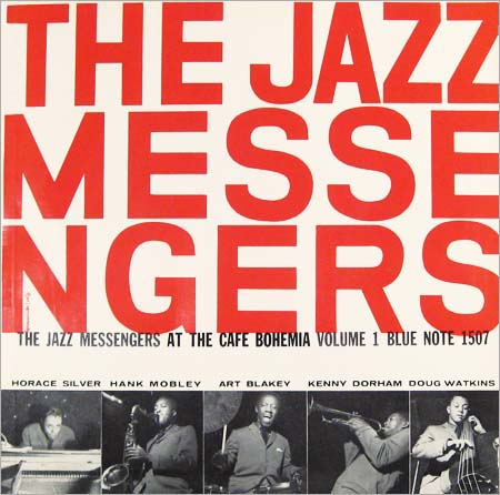
Where Jazz records are concerned – especially 50's be-bop jazz records – their sleeves were designed specifically to sell them to you. They followed the modernism that was hovering over America, they used intermedial design to set the scene and most importantly, they had a large area of text on the reverse giving you an insight into the record.

As you'll be able to see, the reverse of the sleeve isn't nearly as exciting as the cover when you look at it's design but it's still not sure of modernist touches. Like almost every LP on earth it lists the tracks, serial number, printing information and some credits.
The introduction starts with "THIS CHEERFUL", which alone is a strange way to start an introduction but also gives a real insight into the music contained within the sleeve. Along with that, you've got a highly legible, smart, serif font in a strong structured grid of paragraphs, headings and sub headings. This level of structure was unlike almost all record of it's time, mostly due to the fact that the LP had only being recently been invented.
No comments:
Post a Comment